Avanza Android App
Small screen trading
UX, UI design & interface development
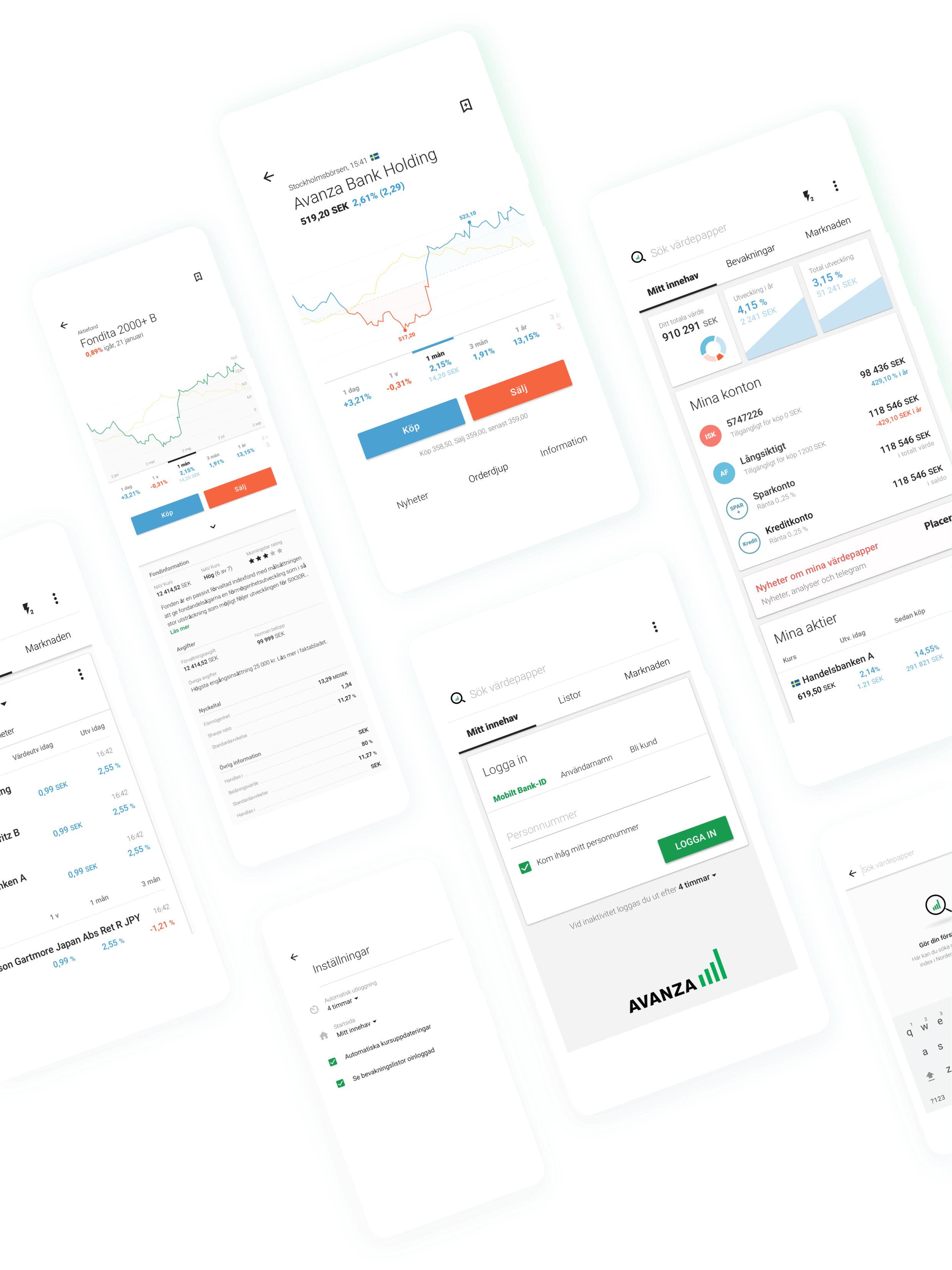
We helped Avanza Bank create their new Android app. Using material design, the app gives the user a clear and easy way to follow the market and trade stocks, funds, and other instruments. From UX and UI design to final app interface development, we worked with Avanza throughout the process.
Get the appConcept, design, code, repeat.
A joyful and efficient process
We started out with a rapid UX phase working closely together with Avanza. Wireframes were used to visualize and discuss different solutions until we had a common understanding of the basic concept.
The design was developed through an iterative process where the final sketches wheren't delivered on paper, but in code.
Design pattern for consistency
Material Design + Avanza
Avanza has a lot of neat functionality. A lot of functionality means a lot of app views and states to design and build.
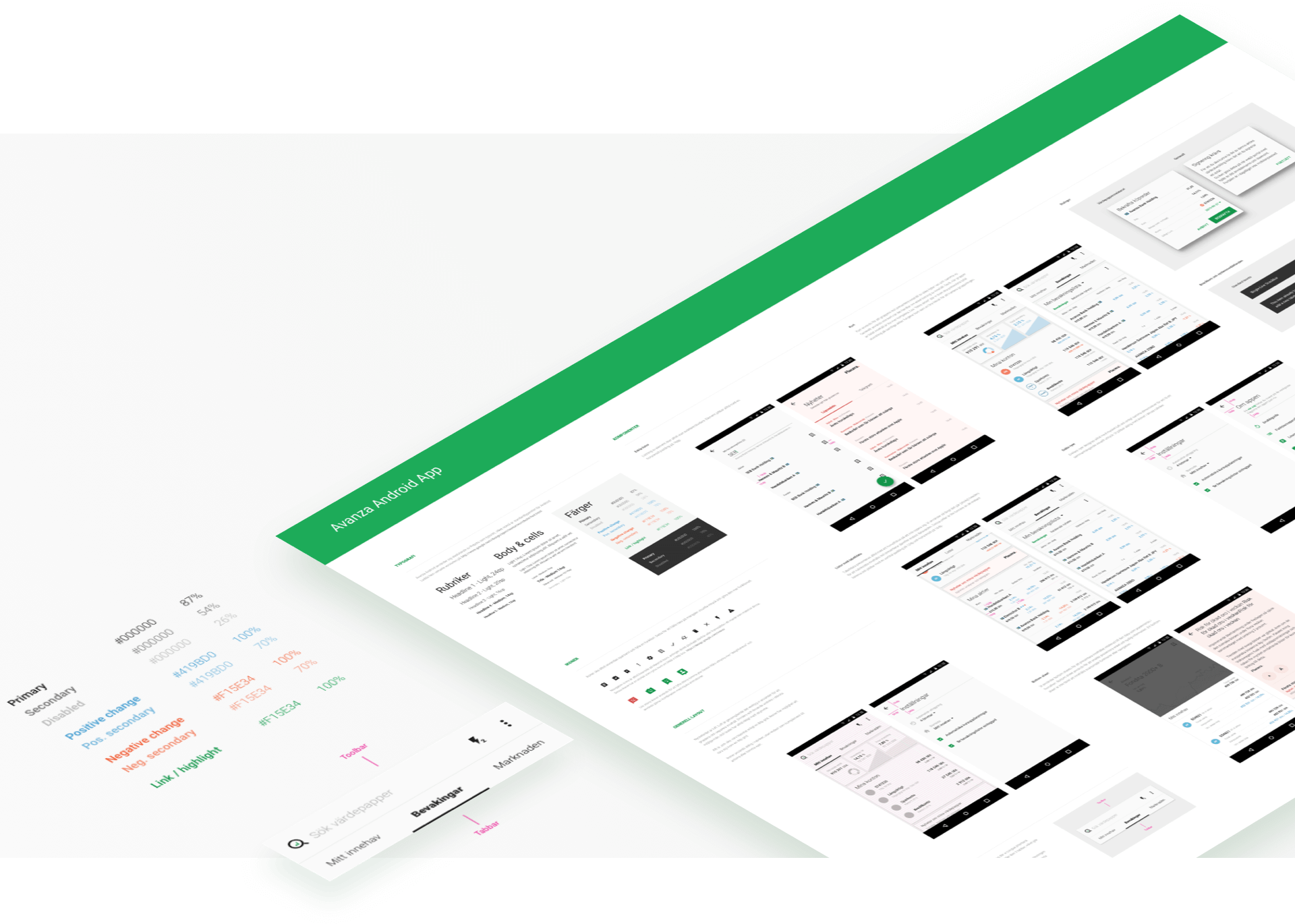
We created a design document for increased app consistency and improved work flow. Adding new basic views should not require another design phase.
Aa
Roboto light
24, 20, 16 & 14sp
Aa
Roboto medium
14, 12 & 10sp
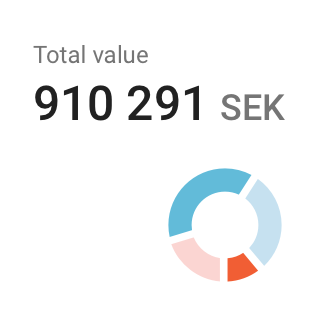
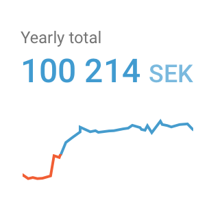
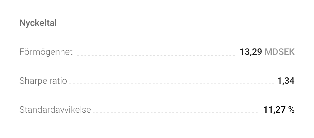

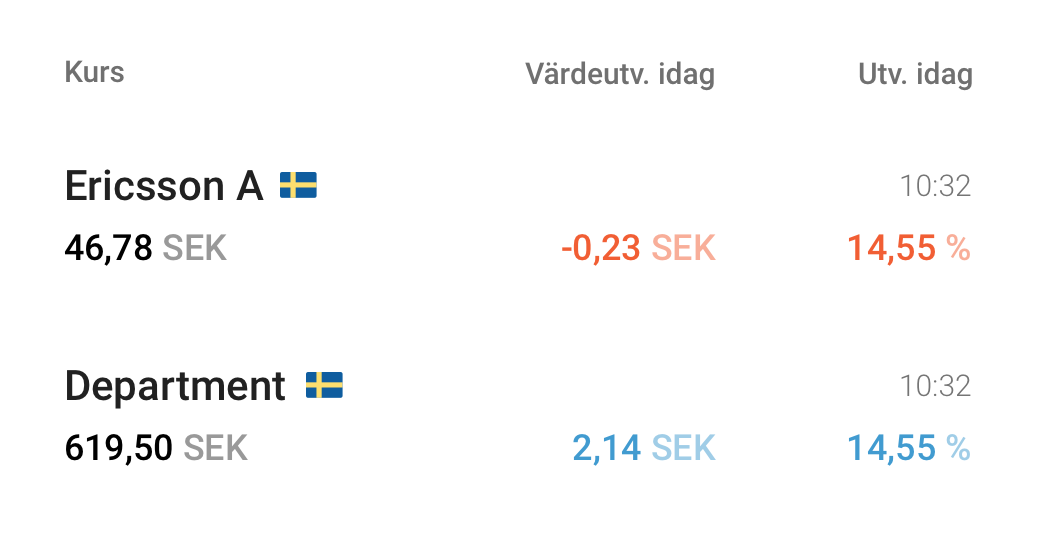
Dos and don'ts
A descriptive & appreciated way to highlight reasons behind chosen design patterns.
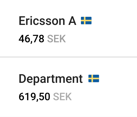

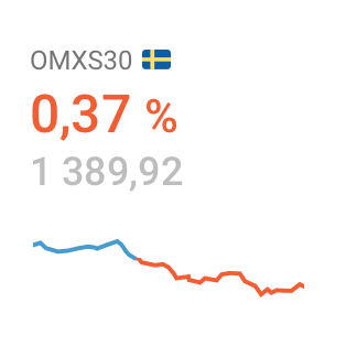
In a design space where lots of data is queen / king, visual structure and hierarchy is maintained through the usage of white space.
Graphical elements such as dividers are avoided.
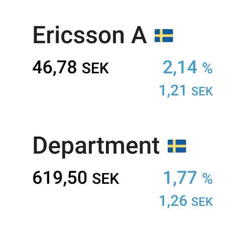
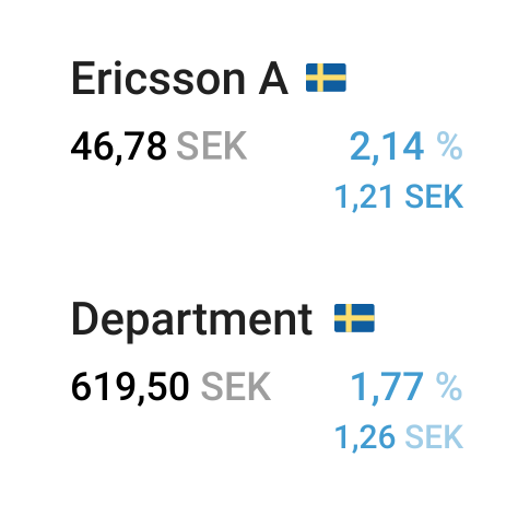
Use font weight and color to create hierarchy, not size.
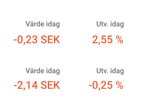
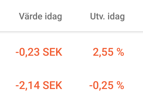
Repetition should always be avoided to spare space for actual data values. Sticky table headers can be a good solution.
