Hyper Island
A complete remake of hyperisland.com
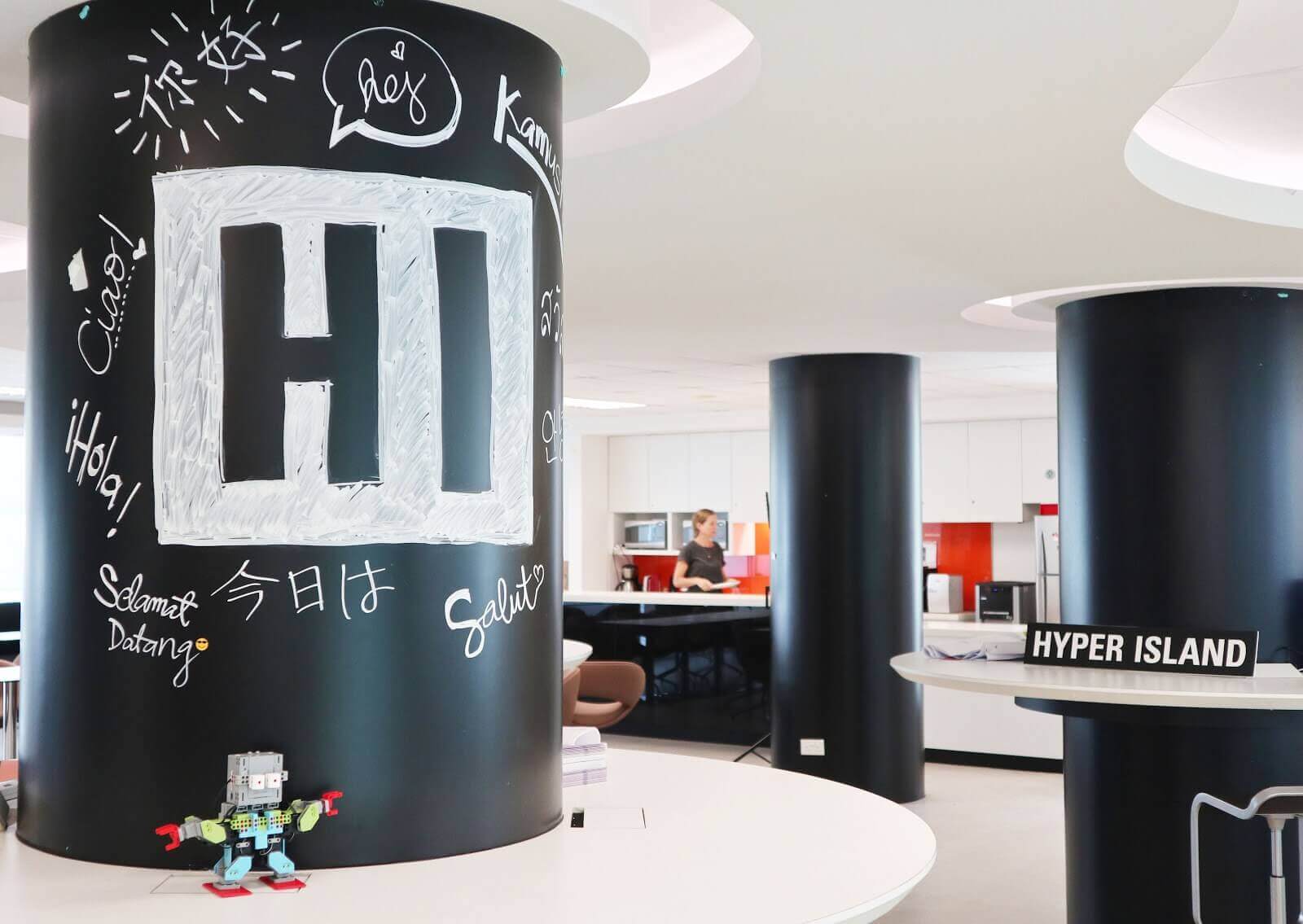
A global school
and a business transformation partner
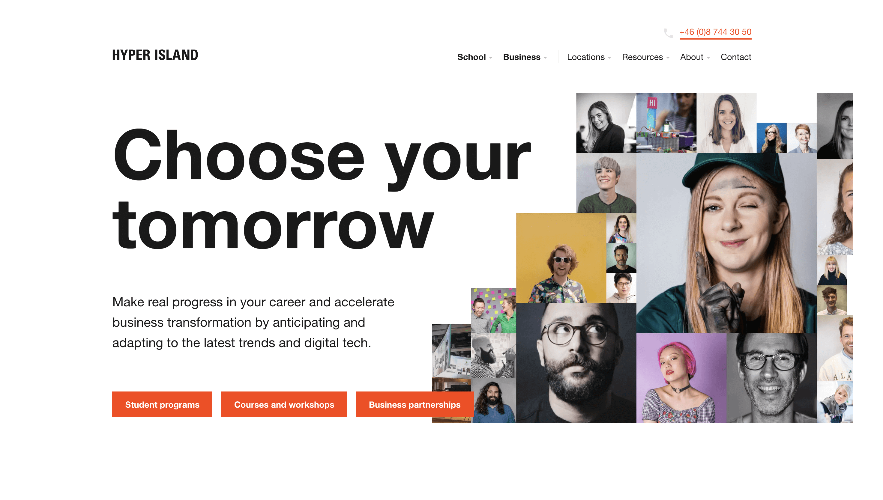
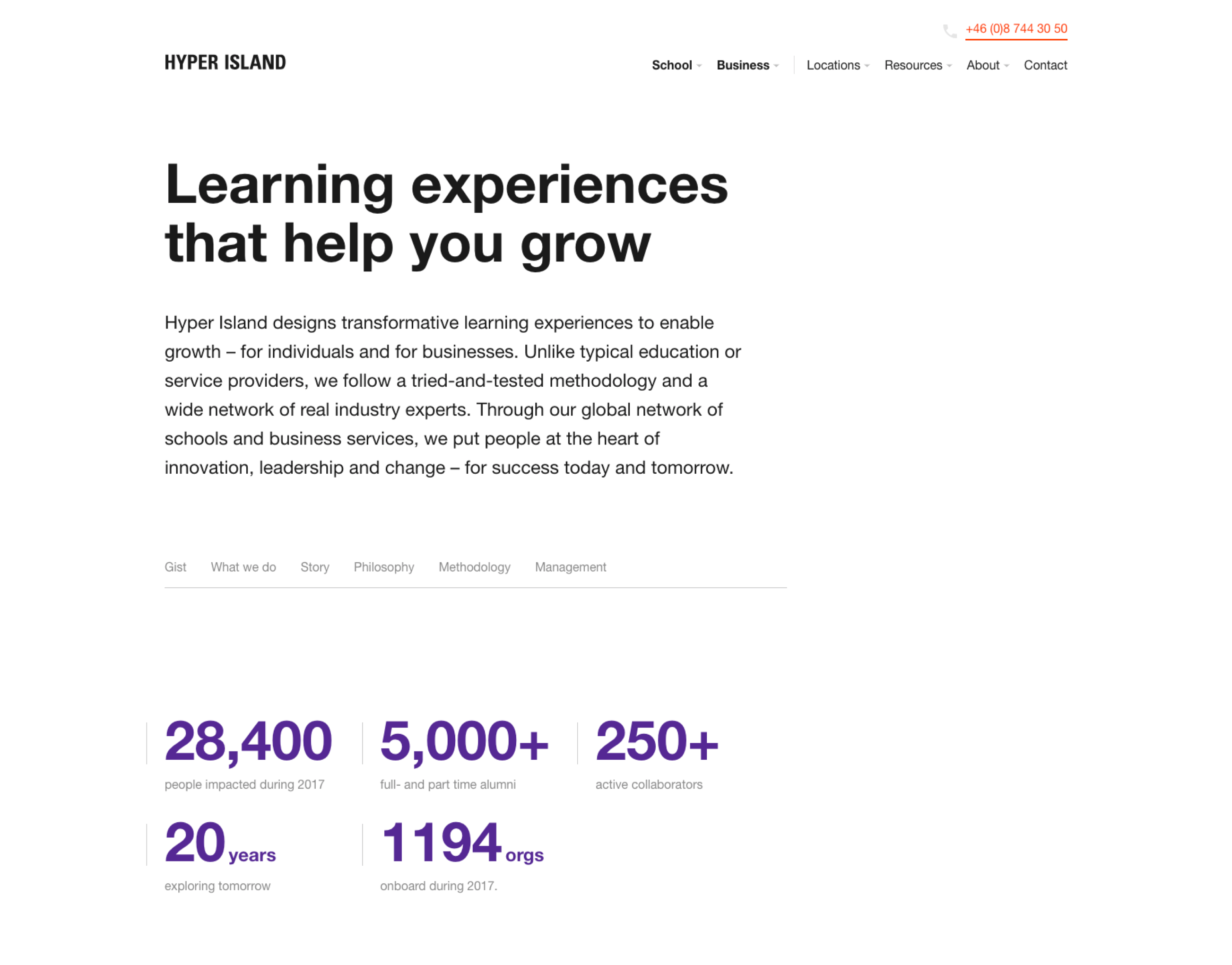
Hyper Island design transformative learning experiences to enable growth – for individuals and for businesses.
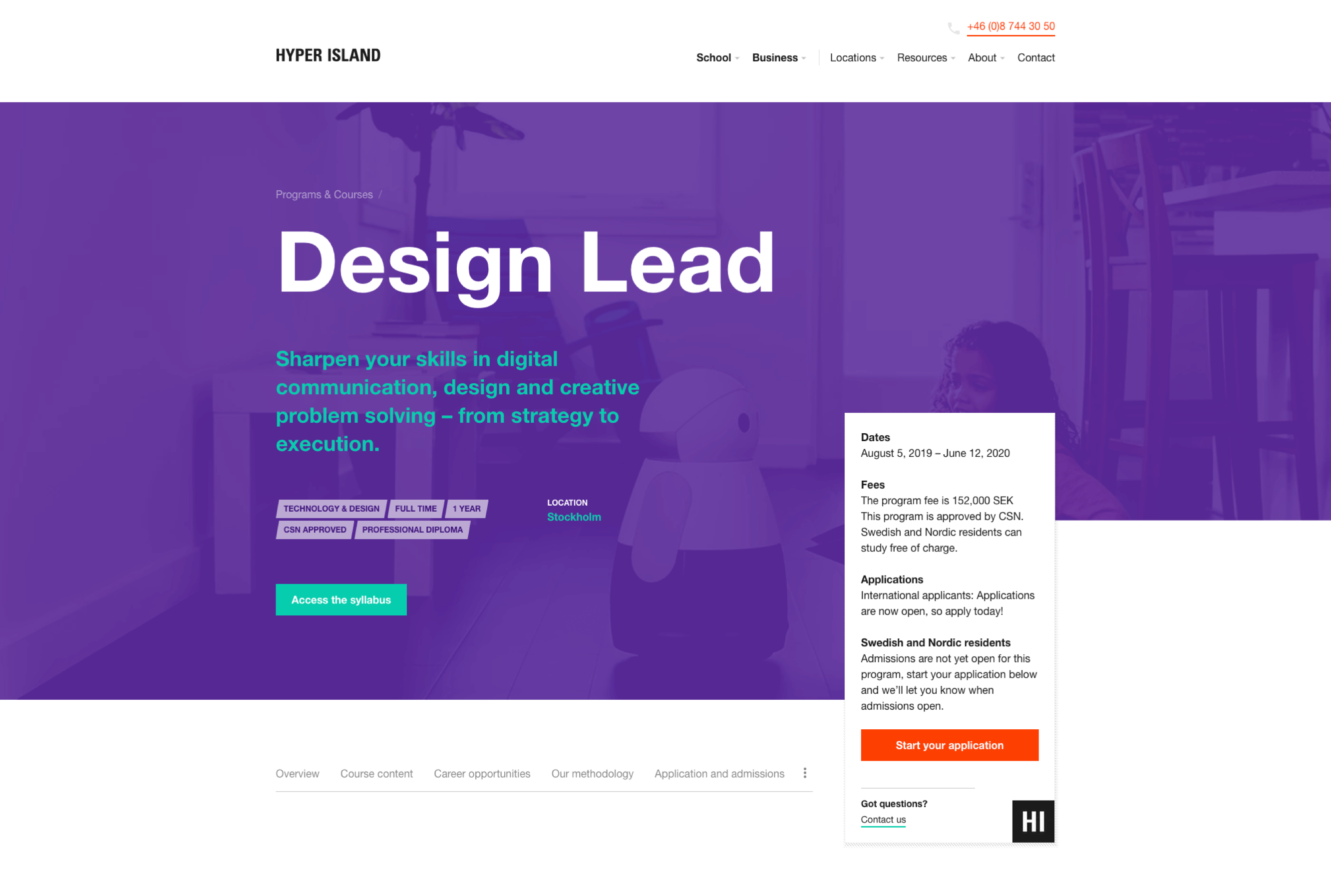
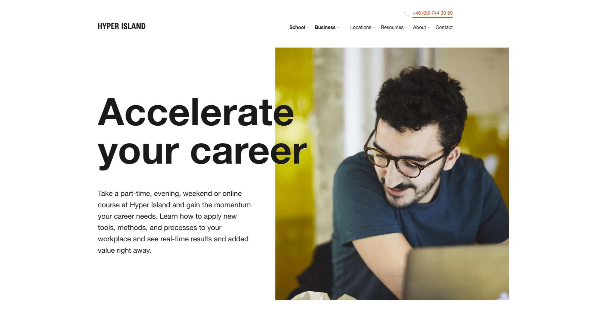
We were awarded the job to rethink and rebuild hyperisland.com.
Visit www.hyperisland.com
Prestudy
What do we need?
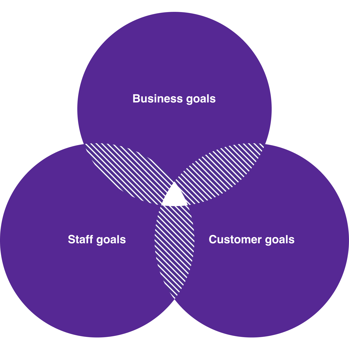
Hyper Island has become a large organization with many stakeholders and customer groups. The first step of the project was to research what needs the old website didn't meet and to define goals for the new.
Site inventory and analysis
One of the first steps was to analyze the current state of the website in order to find areas of improvement.
Define tech requirements
A big part of the prestudy was to define the requirements of each tech platform we were going to use. Hyper Island is no longer just a school, they're very much an e-commerce company and the whole build would need to deliver on many verticals.
Interviewing customer groups & stakeholders
Hyper Island has offices in multiple countries around the world. Talking to customers & employees was key to map project requirements.
The roadmap
The result of the first phase became two things. A roadmap describing the approach to designing and building the site, together with milestones. The second outcome was a structured document with categorized goals and needs from each target group.

Blocks and modules
rather than pages
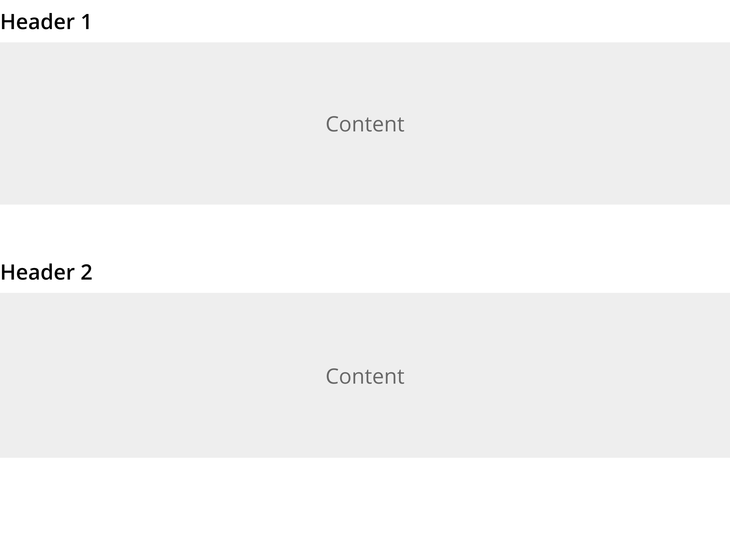
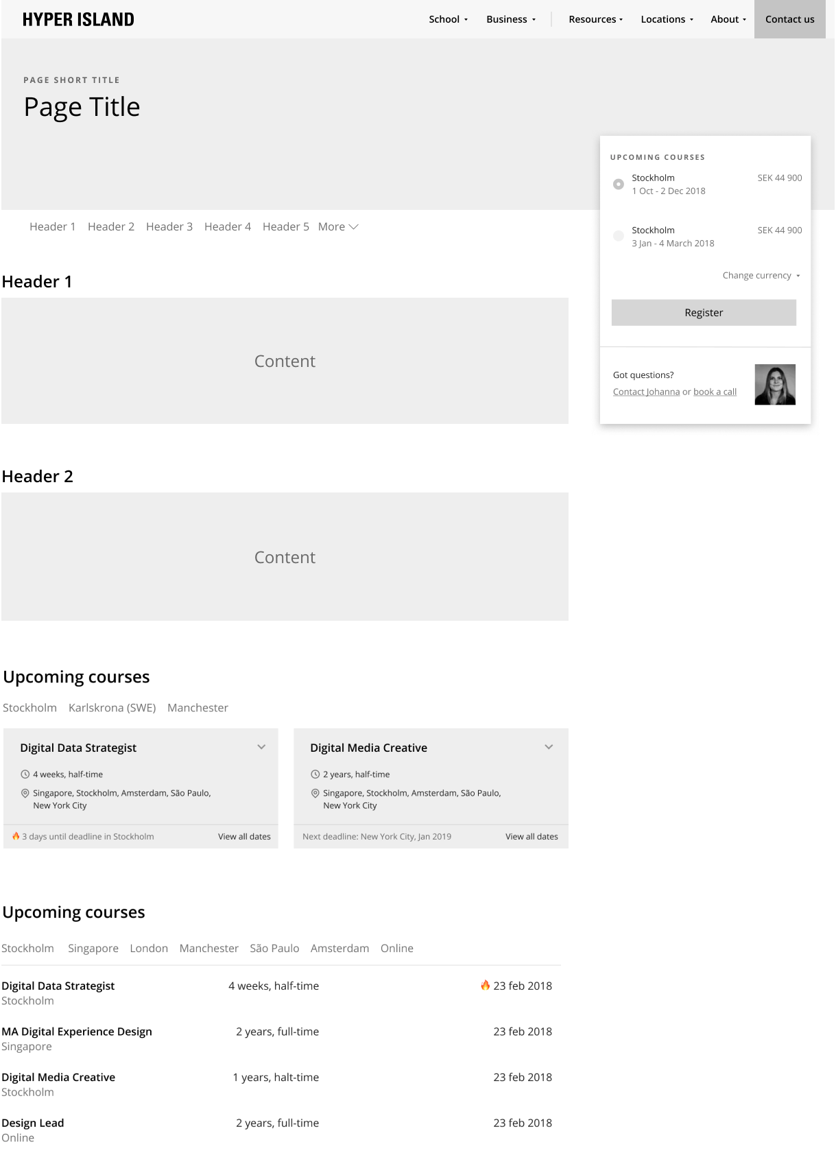
The pages on the site will be put together by different people for many different purposes. It needed to be flexible yet based on a strict pattern.
The framework has a set of foundations – basic ideas that will help both the people who create the pages, but more importantly the visitors.

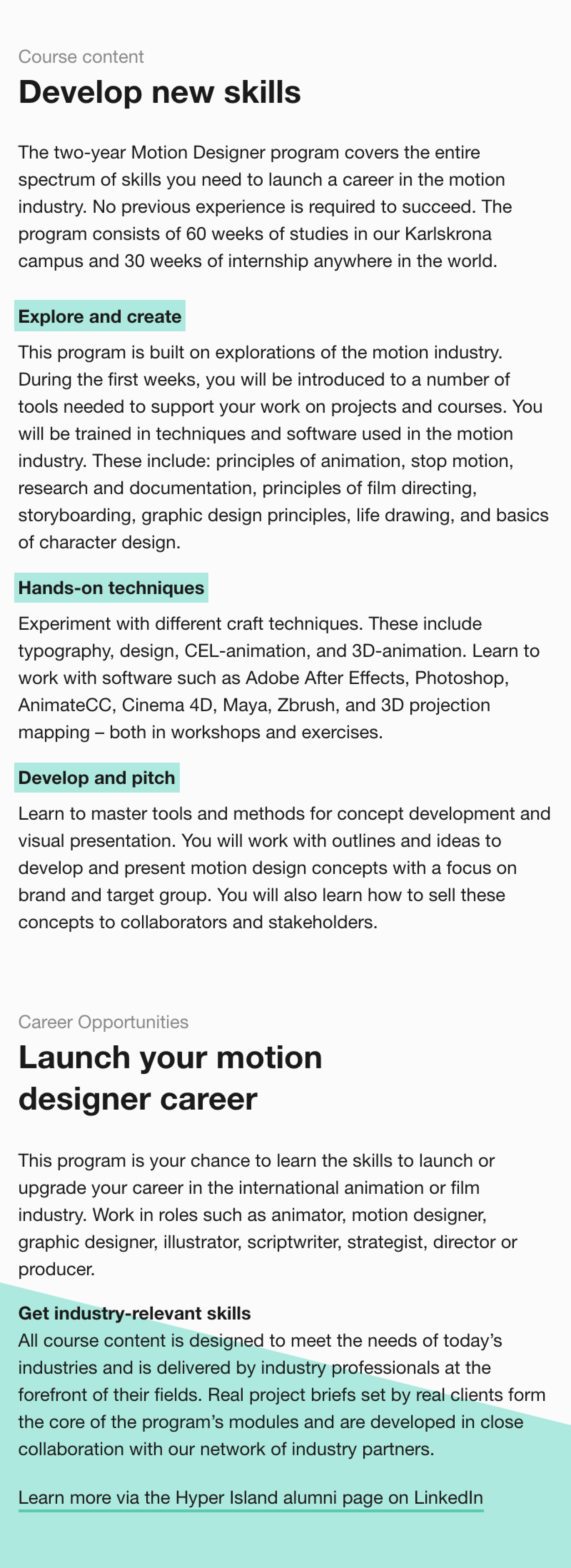
A new interpretation
of an existing brandbook

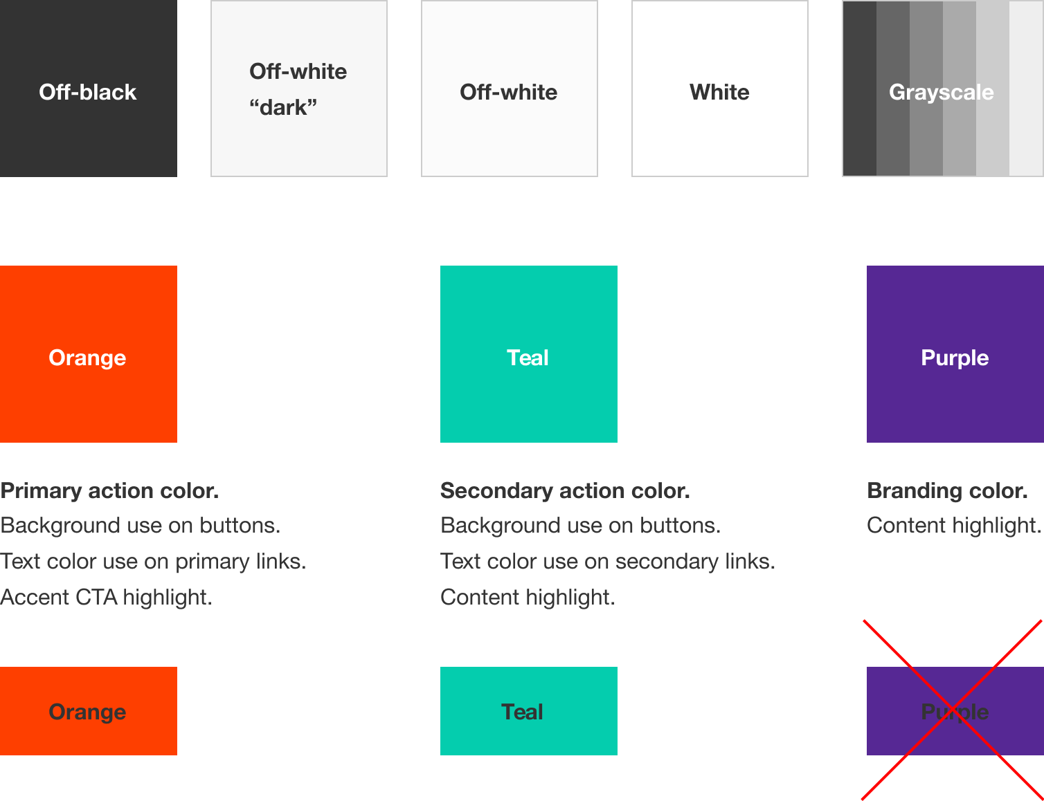
Color palette.
Aa
Helvetica Neue Bold
Aa
Helvetica Neue Regular
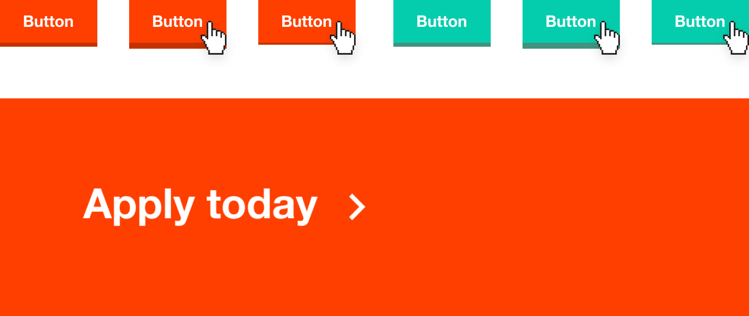
Button variations.

Link styles.
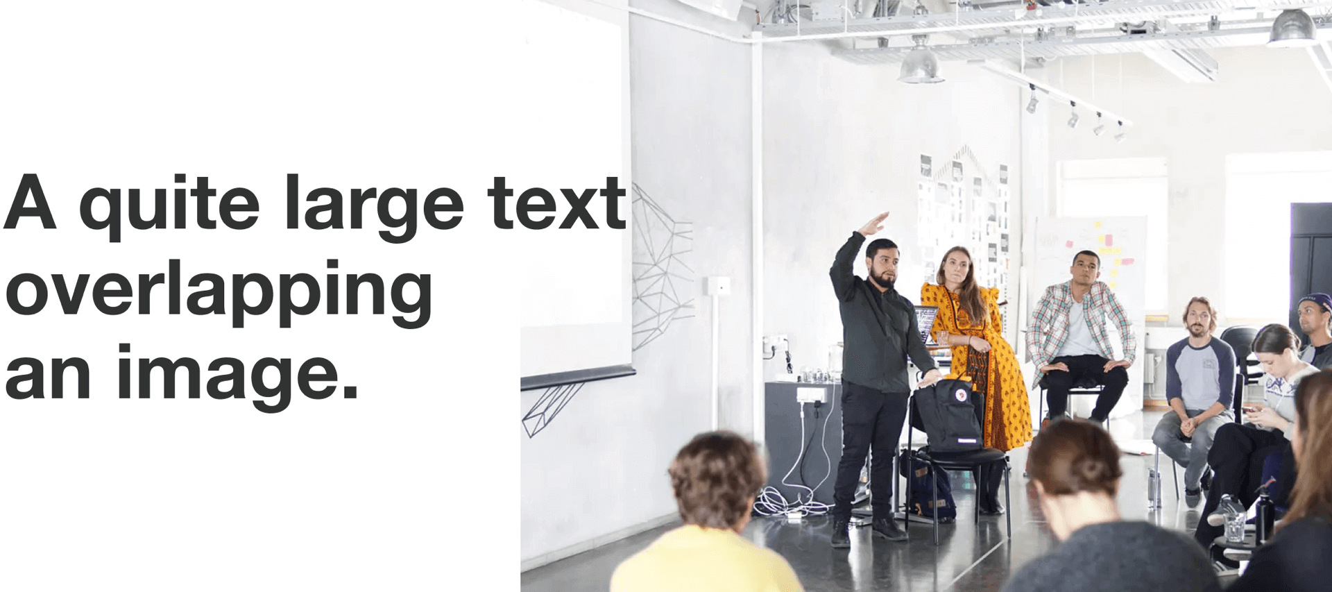
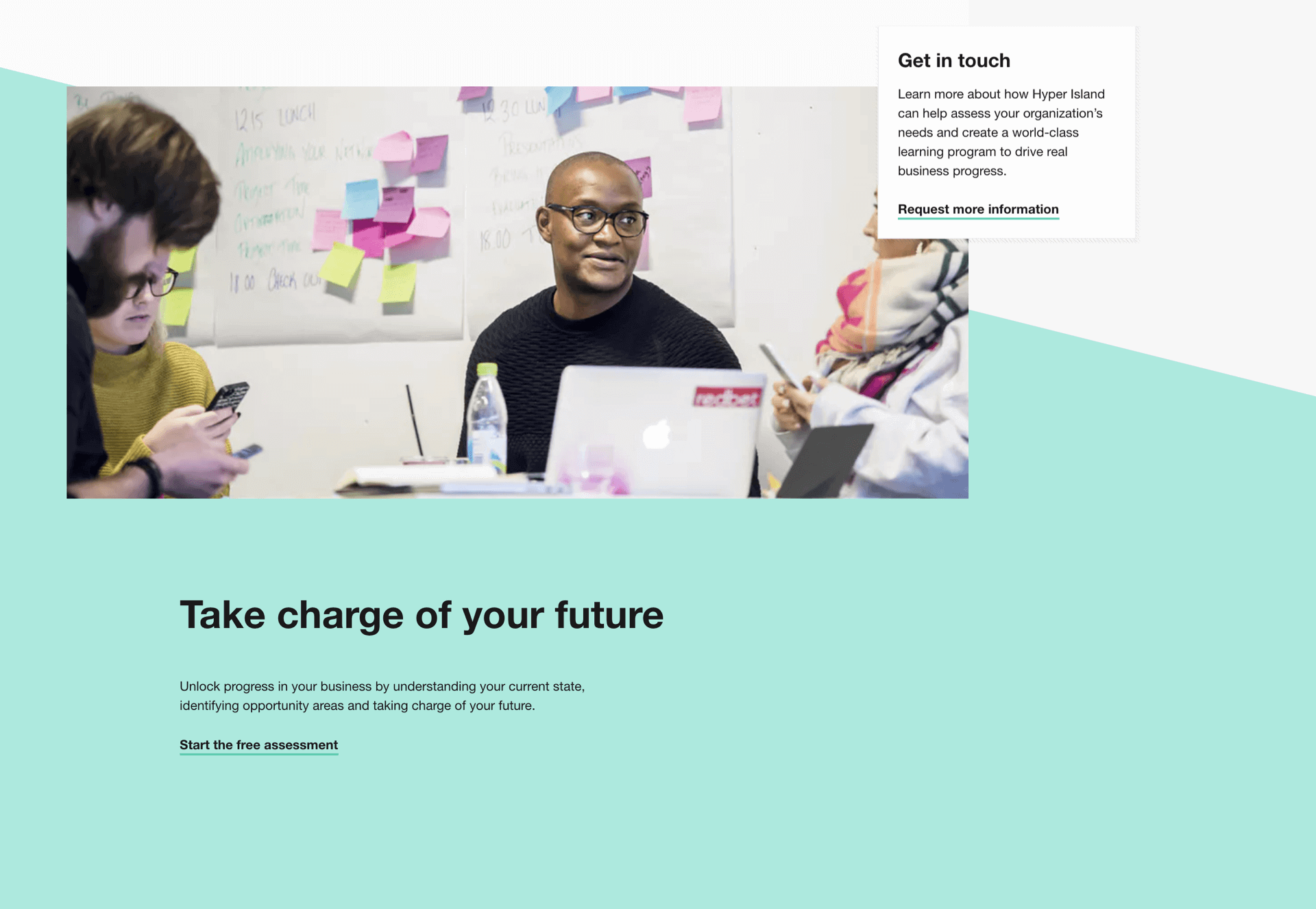
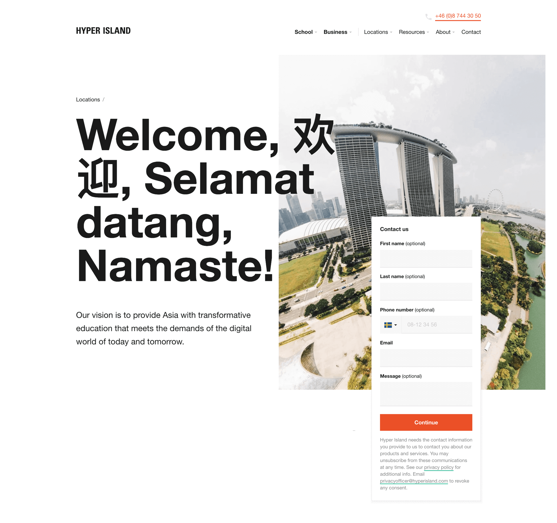
Use of overlap in layouts.

Place image captions in colored cards.
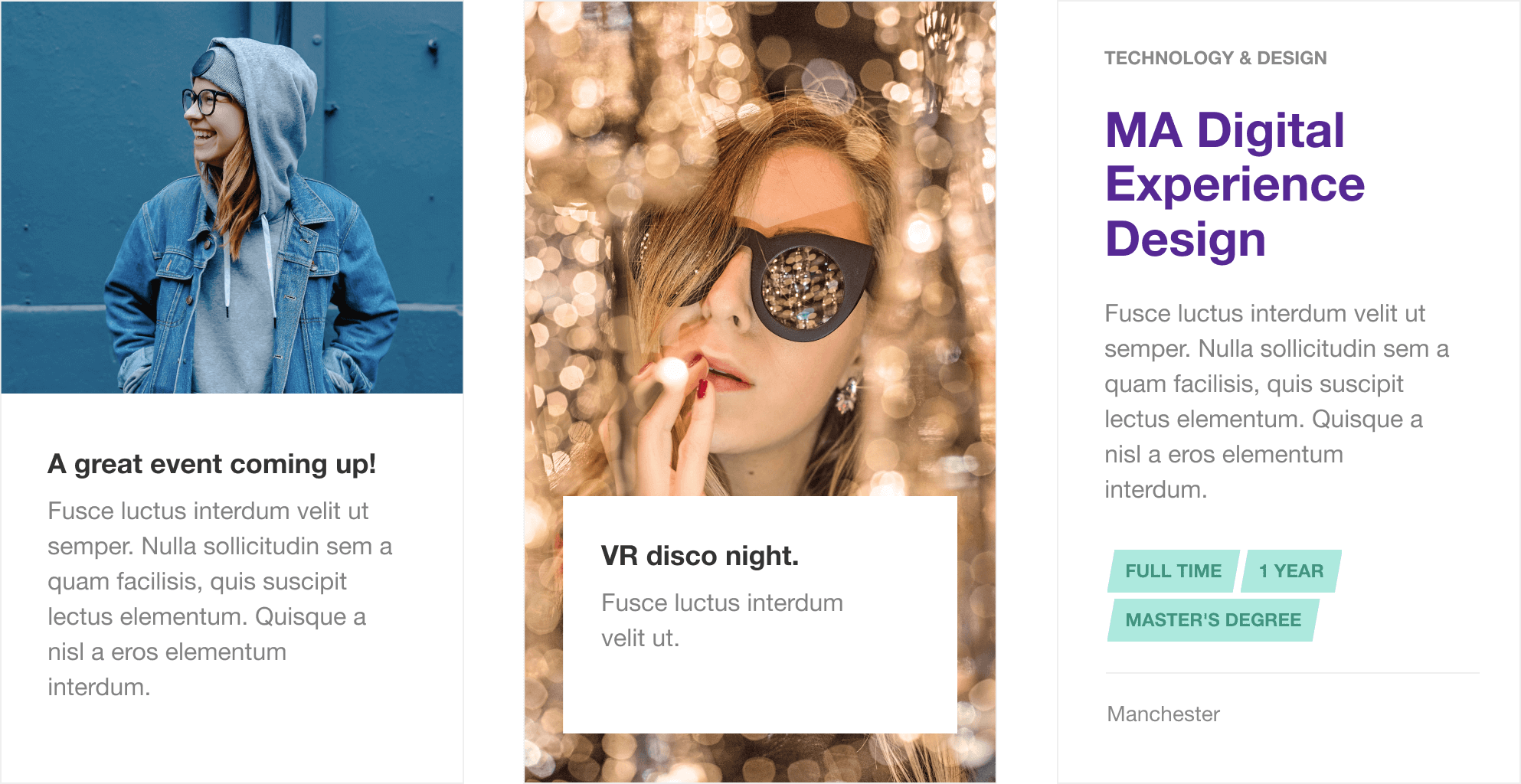
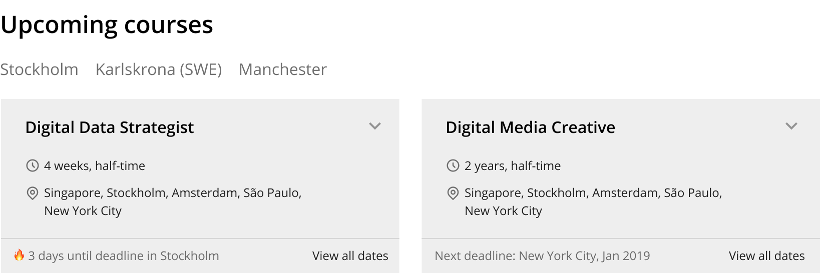
Card variations.
Design guide
and ui component library
The updated look & feel of hyperisland.com needed to feel fresh and modern while staying true to the Hyper Island brand.
We kept the color palette, but added some new rules on how to use it.

Engineering a monster
A big build with many moving parts
The site runs on multiple platforms and integrates with a list of third party services. All to fulfill the needs of editors, finance, sales, marketing and product owners. In multiple markets.
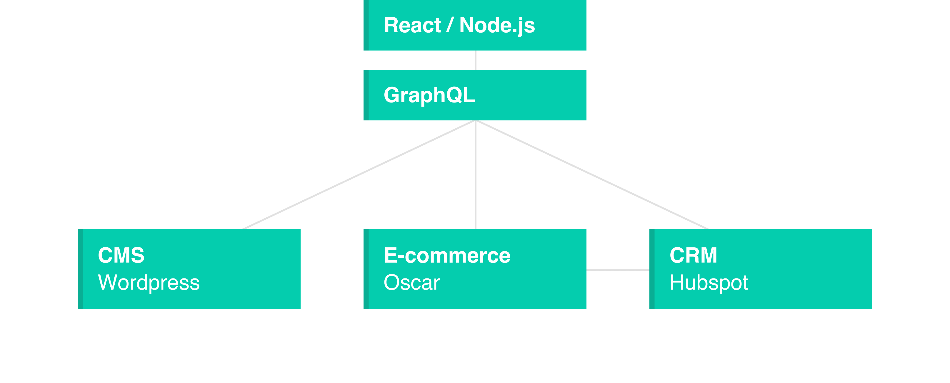
The front-end is built on ReactJS and server side rendered via NextJS. We separated the presentation layer from the business layer. The content comes from both a CMS, an e-commerce system and a CRM. They're all accessed by the front-end via GraphQL APIs.
See the result in action
Visit www.hyperisland.com